
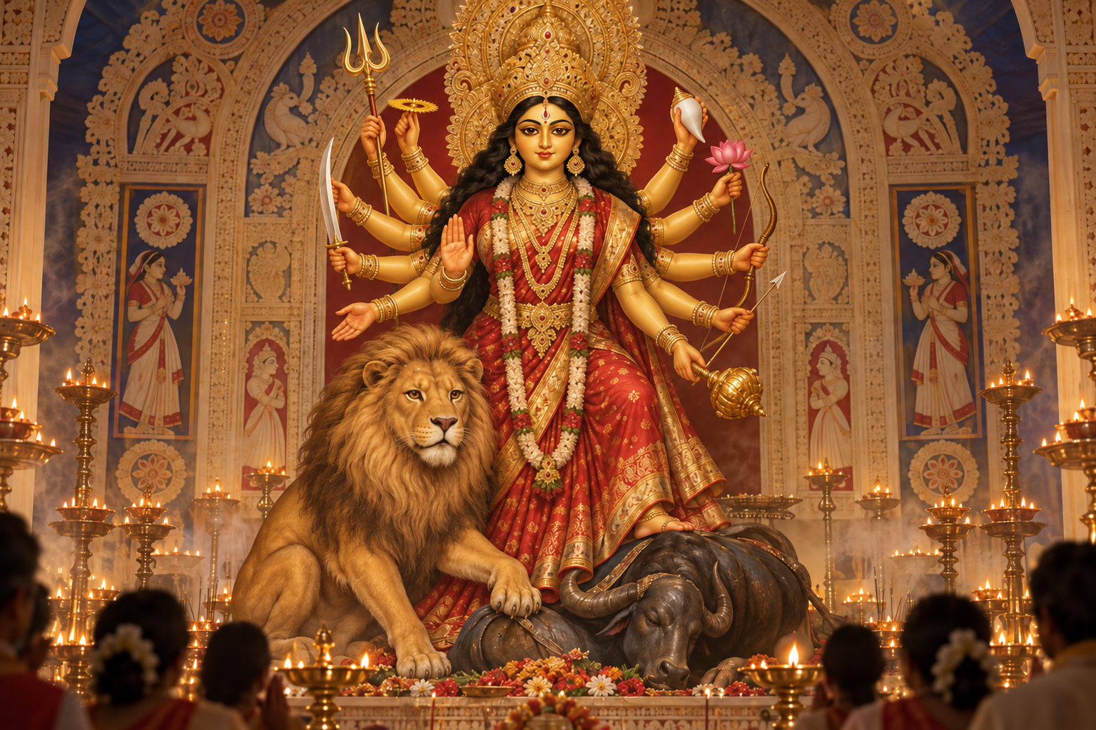
You see one image of Durga with a molten-gold complexion and another with skin as dark as midnight. Which one is traditional? More importantly, what is the color asking you to notice?
The useful answer is not a universal color chart. Durga’s color belongs to a complete sacred image: her form, expression, activity, setting, and local tradition all shape its meaning. You can read that image carefully without reducing the Devi to either a literal human complexion or a single symbolic formula.
Begin with the molten-gold Durga of Durga Puja
During Durga Puja, the clearest baseline is Tapta Kanchana Varna, the resplendent color of molten gold. It is the predominant complexion used for the goddess in the festival’s idols.
Molten gold is more than a convenient label for yellow paint. It evokes luminosity: a form that appears to radiate power rather than merely reflect external light. Gold also allows the image to hold majesty, warmth, auspiciousness, and martial readiness together. Durga is not made gentle by her radiance; her radiance makes divine power visible.
A traditional narrative connects this golden manifestation with Brahma’s invocation of the goddess on behalf of Sri Rama before the great war described in the Ramayana. That association places the radiant form within a setting of worship undertaken before a decisive struggle. The color therefore carries a practical spiritual implication: divine splendor is not an escape from conflict but the force through which dharma meets it.
This predominance is a starting point, not an authenticity test. A golden Durga fits a major Durga Puja convention, but a differently colored image is not automatically incorrect. It may emphasize another quality, follow another inherited practice, or belong to a different visual setting.
Read each color as an emphasis, not a rigid definition
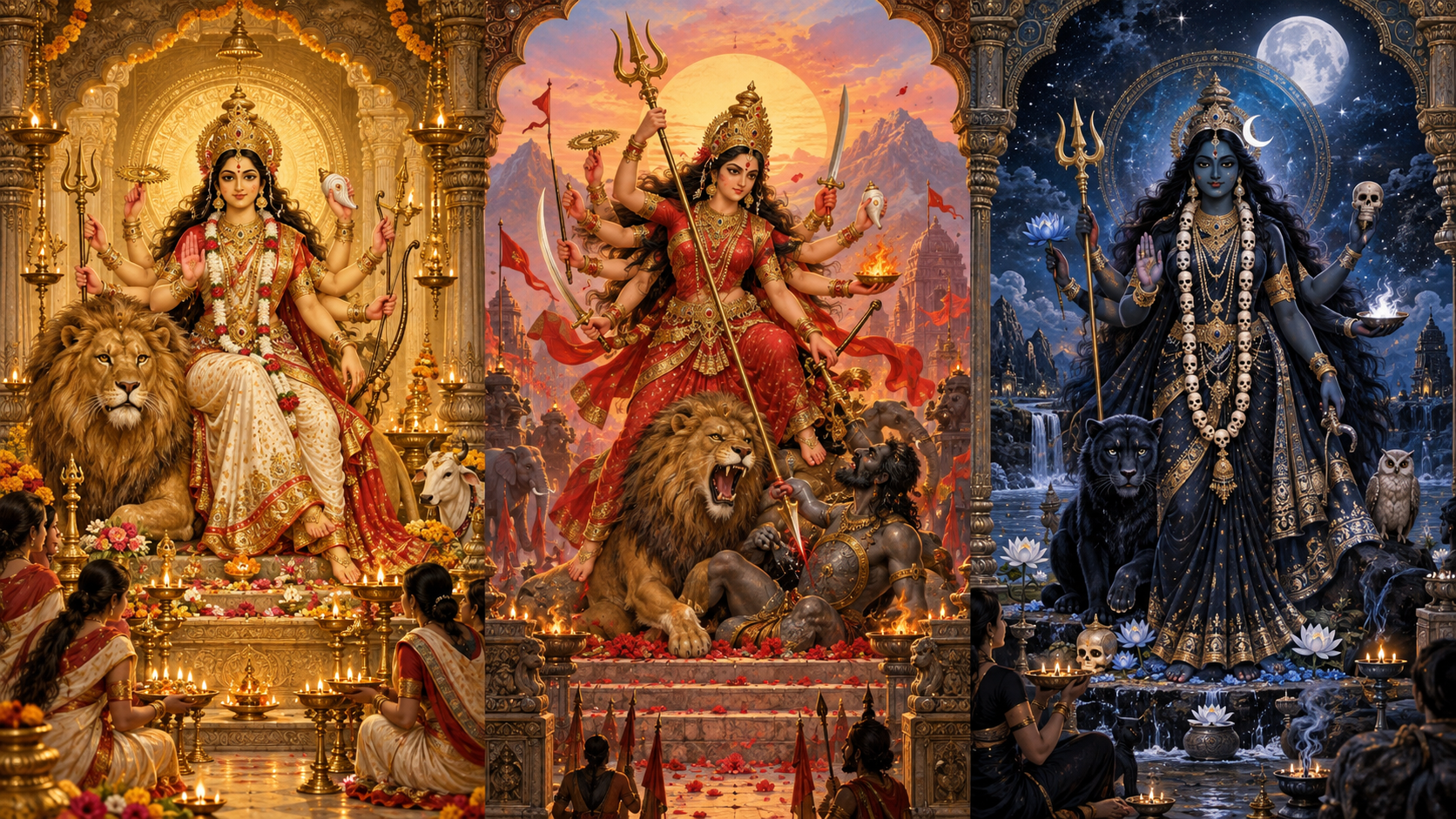
Sacred color works more like a theological accent than an identity card. It directs your attention toward a quality of Shakti, but it does not imprison the Devi within that quality. The same Durga can be luminous and formidable, serene and active, beautiful and overwhelming. A color brings one dimension forward while the complete form preserves the others.
| Color | Possible iconographic emphasis | What you should check |
|---|---|---|
| Molten gold or golden yellow | Radiance, auspicious presence, majesty, and power made visible | Is this a Durga Puja image using the predominant Tapta Kanchana Varna convention? |
| Red | Active Shakti, intensity, courage, and energy engaged in the world | Is red the goddess’s complexion, her garment, the background, or a combination of these? |
| White or very pale | Clarity, serenity, restraint, and a calm mode of divine authority | Do the expression and other features reinforce serenity, or do they deliberately contrast with it? |
| Dark or black | Immensity, mystery, fierce protection, and power that exceeds ordinary categories | Does the local tradition understand darkness as fierceness, transcendence, protection, or more than one of these? |
These are reading prompts, not translation keys. Red does not always mean only anger, white does not make a form passive, and black does not mean evil. That last correction matters especially. Applying the moral equation of light equals good and dark equals bad to Hindu sacred art will produce a serious misreading. Divine darkness can express a power too vast, concentrated, or unbounded for an ordinary visual category.
You should also separate complexion from composition. A golden face under red illumination, a pale form dressed in red, and a red-bodied form are three different artistic decisions. Before assigning meaning, identify exactly where the color appears.
Use this five-step method when you encounter a Durga image
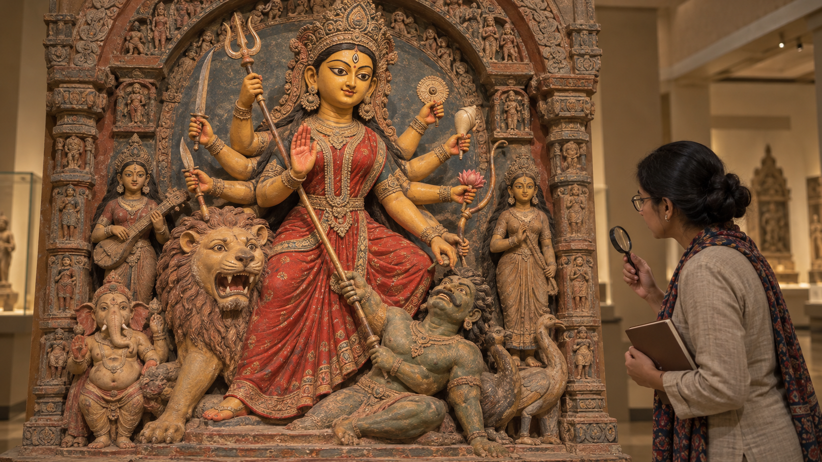
- Identify the setting. Ask whether you are seeing a festival idol, a temple image, a household shrine, a painting, or a contemporary digital design. A convention dominant in Durga Puja need not govern every other setting.
- Locate the color precisely. Distinguish the goddess’s complexion from her clothing, ornaments, halo, backdrop, and colored lighting. Photographs can also shift a warm gold toward orange or make a deep blue appear black.
- Read the whole form. Notice the expression, posture, gestures, attributes, movement, and surrounding figures. If several elements communicate calm while one color appears intense, the contrast may be intentional rather than contradictory.
- Ask what quality the image foregrounds. Does the image make you notice radiance, disciplined force, serenity, protection, or unfathomable power? Phrase your answer as an emphasis: “This color brings forward…” is usually more accurate than “This color always means…”
- Check the living context. If the image belongs to a community, ask its worshippers, priest, organizer, or artist about the choice. Local memory can explain what a generic symbolism chart cannot. Record that explanation as belonging to this form and setting rather than turning it into a rule for every Durga image.
This sequence keeps interpretation anchored in what is actually before you. It also gives you a useful way to compare two images: compare setting with setting, body color with body color, and the complete iconographic mood with the complete mood.
Avoid the three mistakes that flatten Durga’s sacred form
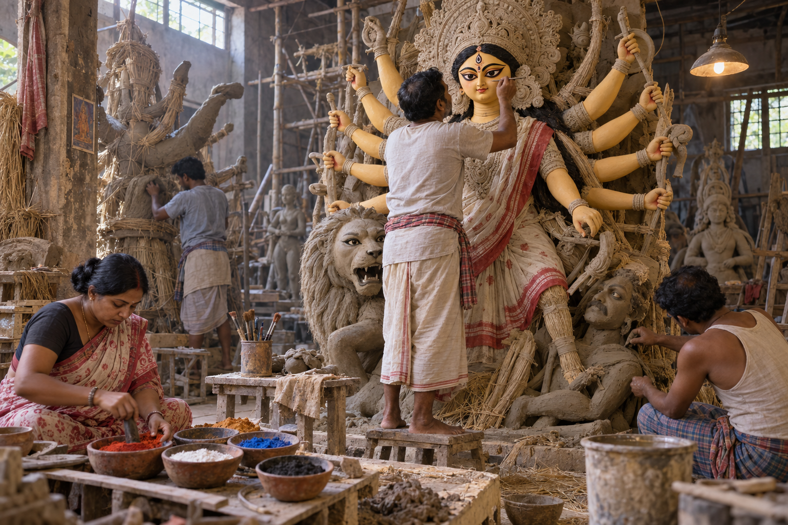
The first mistake is to treat color as biological portraiture. A murti is not trying to settle the human question of what Durga’s skin “really” looked like. Sacred form makes divine qualities perceptible. Reading it as a modern portrait strips away much of what the image is doing.
The second mistake is to turn one prominent convention into the only permissible convention. The widespread golden Durga of Durga Puja deserves recognition precisely because it is a strong, meaningful tradition. It does not need to be defended by declaring every dark, red, pale, or differently rendered Durga false.
The third mistake is to rank sacred forms by complexion. A lighter image is not spiritually higher, and a darker image is not less auspicious. That hierarchy comes from social prejudice, not from attentive darshan. When such an assumption arises, return to the complete form and ask which power of the Devi the artist or community is presenting.
There is an equal error at the other extreme: inventing elaborate meanings without context. If all you know is the pigment, keep your conclusion provisional. “This may emphasize fierce protection” is more honest than claiming access to an artist’s intention you have not established.
Key takeaways
- Molten gold, or Tapta Kanchana Varna, is the predominant complexion of Durga idols during Durga Puja.
- Golden radiance presents divine splendor as active power, not as mere decoration.
- Red, white, and black can foreground different dimensions of Shakti, but none has one fixed meaning in every image.
- Complexion, clothing, backdrop, and lighting must be read separately before they are interpreted together.
- A local explanation tied to a particular image is more reliable than a universal color chart.
- No sacred form should be ranked by how light or dark its complexion appears.
At your next darshan, pause before asking which color is the “correct” Durga. First identify what has been colored, then read the complete form, and finally ask which aspect of the Devi has been brought near. That small discipline turns color from a surface detail into a doorway to understanding.
References

Leave a Reply
You must be logged in to post a comment.